


DYSU #80 : Cool Colours
>> Thursday, July 12, 2012
Ok, I admit it. When challenge #80 was announced at DYSU, I had to ask for some clarification on what "cool" colours meant. I was informed that while I could interpret it how I want, probably the best explanation was for blues, greens, browns, whites, and maybe purples. At first I was thinking cool being "awesome" which would have made my card somewhere more in the lines of orange and reds, good thing I asked :)
Well by this time we should be all settled into the new place, but I think I am going to make use of my pre-schedule option on the blog anyways. Its one less thing to think about amidst all the boxes that still need sorting.
Be sure to check out the Do You Stack Up blog for a full list of sponsors and some wonderful inspiration from the rest of the design team.

How would you interpret cool colours?
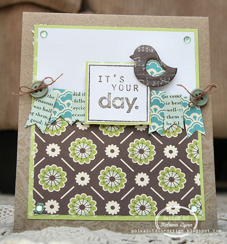
This is *now* how I interpret cool colours :)
SUPPLIES
October Afternoon Paper
October Afternoon Paper
Cosmo Cricket Paper
Recollections Stamp
American Crafts chipboard
Vintage buttons and floss
Well by this time we should be all settled into the new place, but I think I am going to make use of my pre-schedule option on the blog anyways. Its one less thing to think about amidst all the boxes that still need sorting.
Be sure to check out the Do You Stack Up blog for a full list of sponsors and some wonderful inspiration from the rest of the design team.


6 comments:
It may not be reds and oranges but it is still very "cool". Love this card. That little bird and the bunting are gorgeous.
Hope your move went well and that the unpacking is not too stressful.
Hugs
Denise xx
This card is pretty much perfect - I wish I had made it!
-Sarah
Well I think it is AWESOME Rebecca! You know I love your sweet little banners. I love them even more when you use OA papers!!! Darling card ;)
Cute! You used some of my favorite OA papers.
Super lovely!! Love all the banners and that chubby bird ;) Hugs, Joan
Beautiful banner, what a fun bird and the beautiful sentiment! love every bit of this.
Post a Comment