Polkadot Door Challenge : Layout
>> Thursday, May 5, 2011
I thought I would have another go at the {May} Polkadot Door Inspiration Challenge, this time working on a layout since my cardbox is full to bursting! Its coming much easier the more I scrapbook, and its almost to a point where I am enjoying it again ....
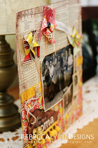 This layout turned out different than I imagined! I originally had some very bright and cheerful colours on the page, but it gradually turned into something much more vintage looking ... I still got the pinwheels on there though, they are so easy to incorporate into projects!
Besides wanting to do a layout for our challenge, I needed to get a project done for my most recent Design Team!
Duetica.com is a completley new sort of company. Each and everyone of us uses computer fonts in our daily life and Duetica is taking a fun approach to the way we design using fonts/text! You need to head over to the site and check it out for yourself. Watch a tutorial or two to see what all the fuss is about, browse their selection of fun fonts, and then catch the blog for some fun inspiration from my fellow design team members. I promise, the trip to Duetica.com will be worth your time!
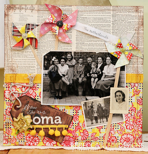
SUPPLIES
Basic Grey Paper
Basic Grey Paper
My Minds Eye Floss
Prima Flower
Misc Button, Wood Veneer
Chatterbox Rub-ons
Duetica Floot Font




3 comments:
That is a gorgeous page Rebecca - love your color combo. Think I might need to do a layout, too and link it up :)
Love this! Soooo pretty!
Love the color combo too.
lisa
Post a Comment